
Project
A serene visual identity and logo design built on tranquility, balance, and professional care
(client)
SV Massages
(industry)
Health & Fitness
(services provided)
Brand Identity
Print & Collateral Design
(project turnaround
time)
1 month
Project
A serene visual identity and logo design built on tranquility, balance, and professional care
(client)
SV Massages
(industry)
Health & Fitness
(services provided)
Brand Identity
Print & Collateral Design
(project turnaround
time)
1 month
(synopis)
SV Massages needed a gentle, professional brand identity to establish a welcoming presence. Adept Studio developed a cohesive brand that highlights the core values of personal attention, relaxation, and physical well-being.
(the logo)
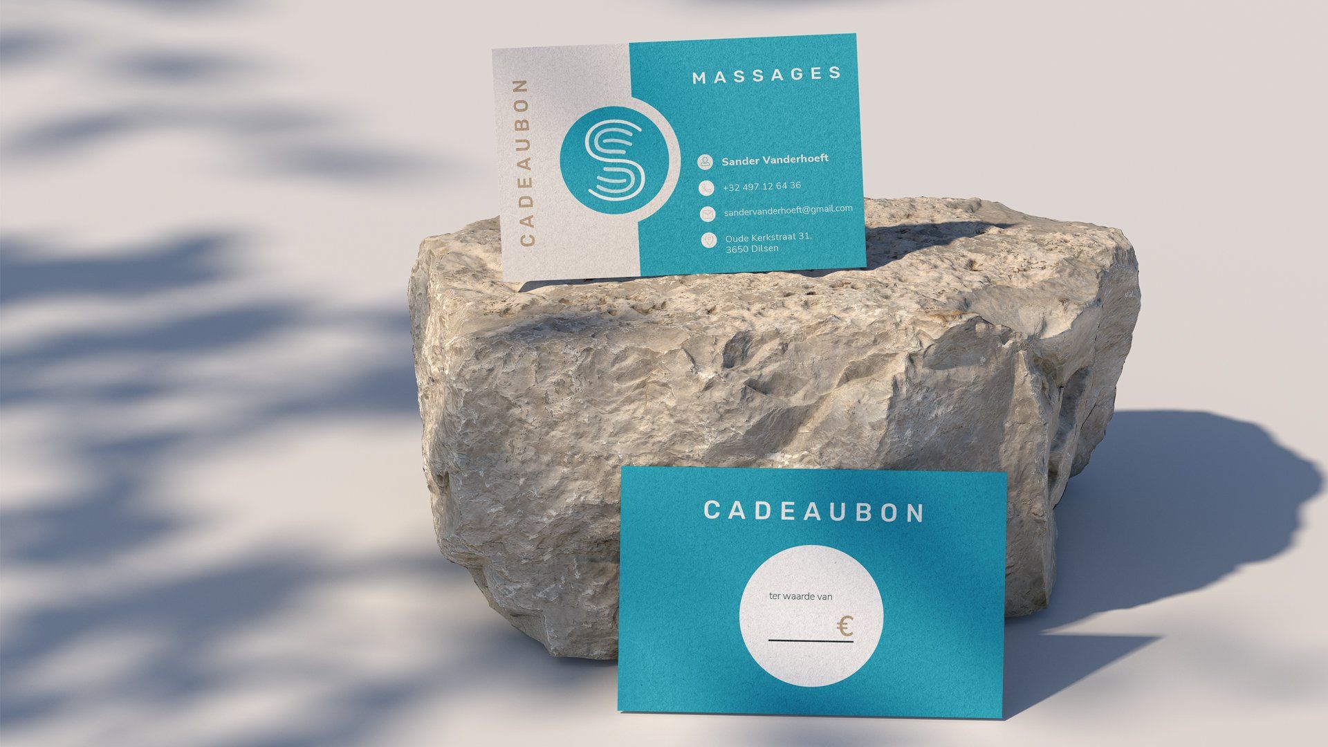
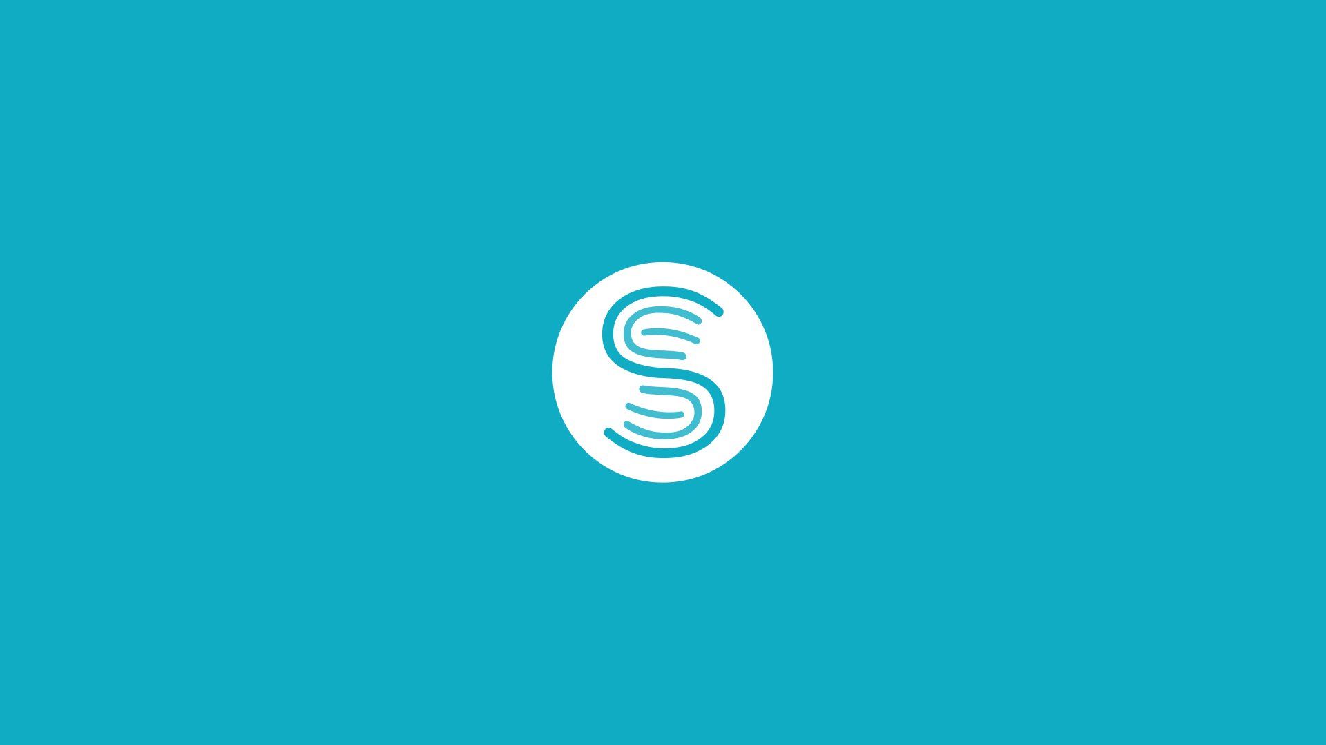
The logo features an elegant, abstract icon depicting two hands engaged in a soothing massage movement, subtly integrated with a flowing S-shape detail as a personal touch for Sander, the owner.
Designed with clean, organic line work, the mark communicates hands-on expertise and personal attention while maintaining a refined, modern look that translates effortlessly across print and digital media.
(the brand)
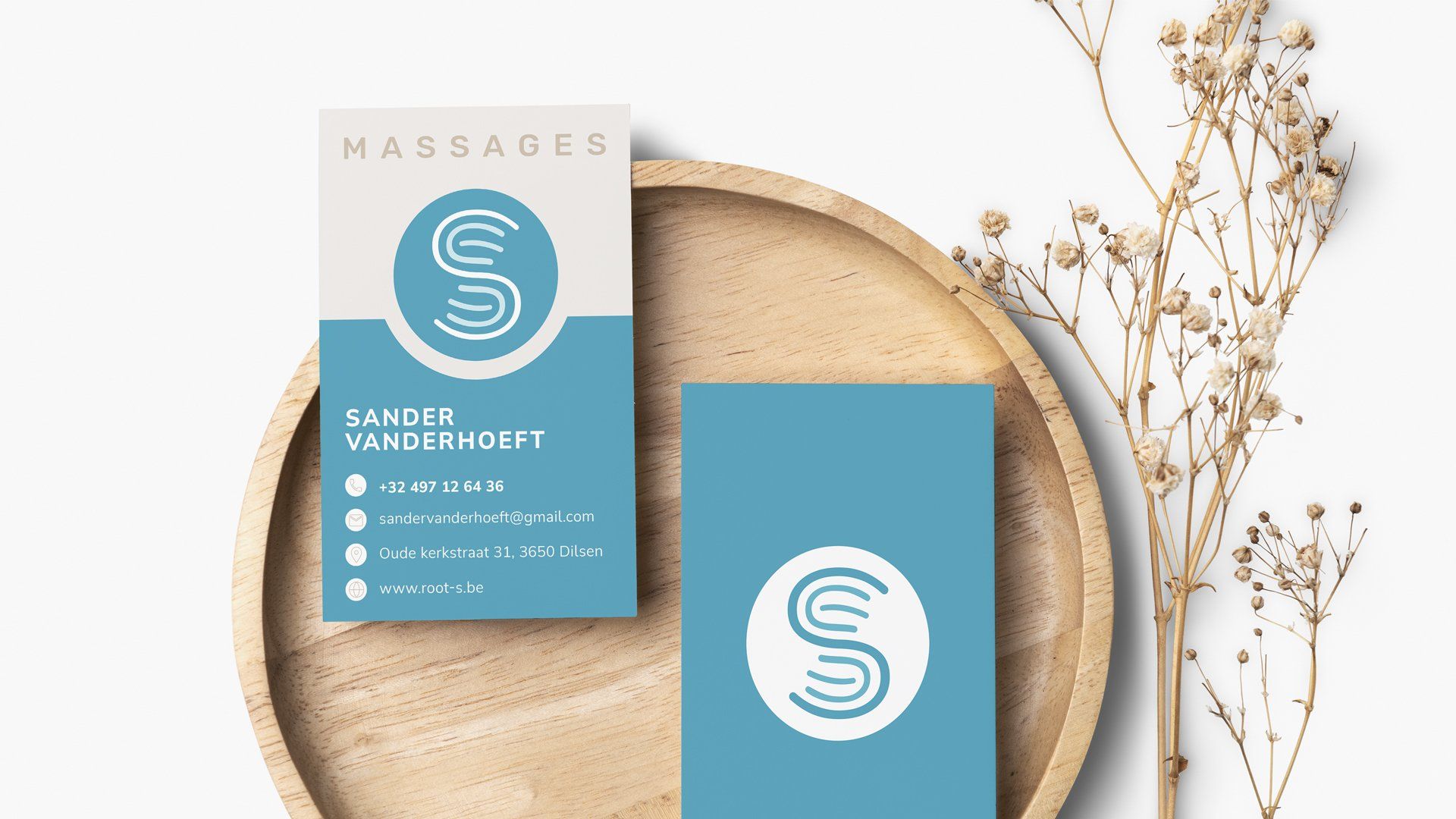
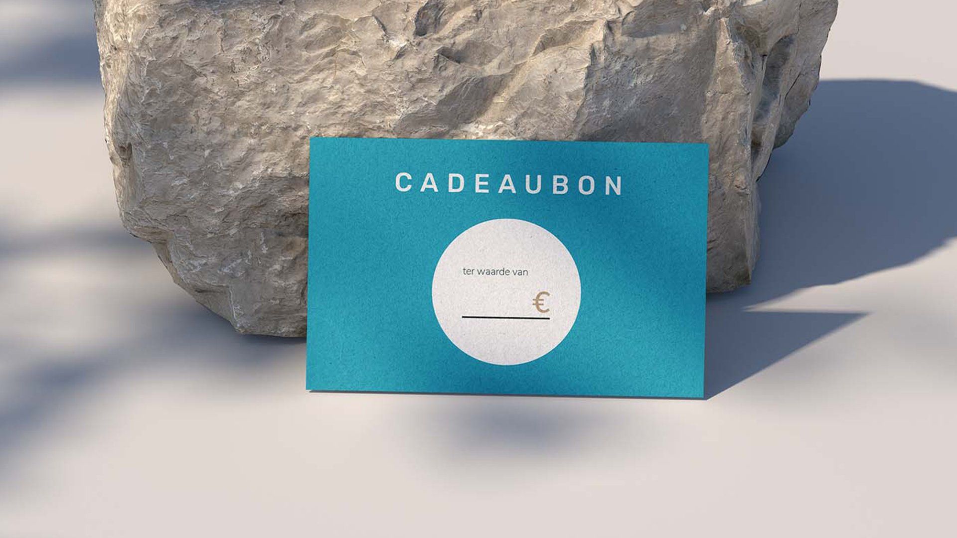
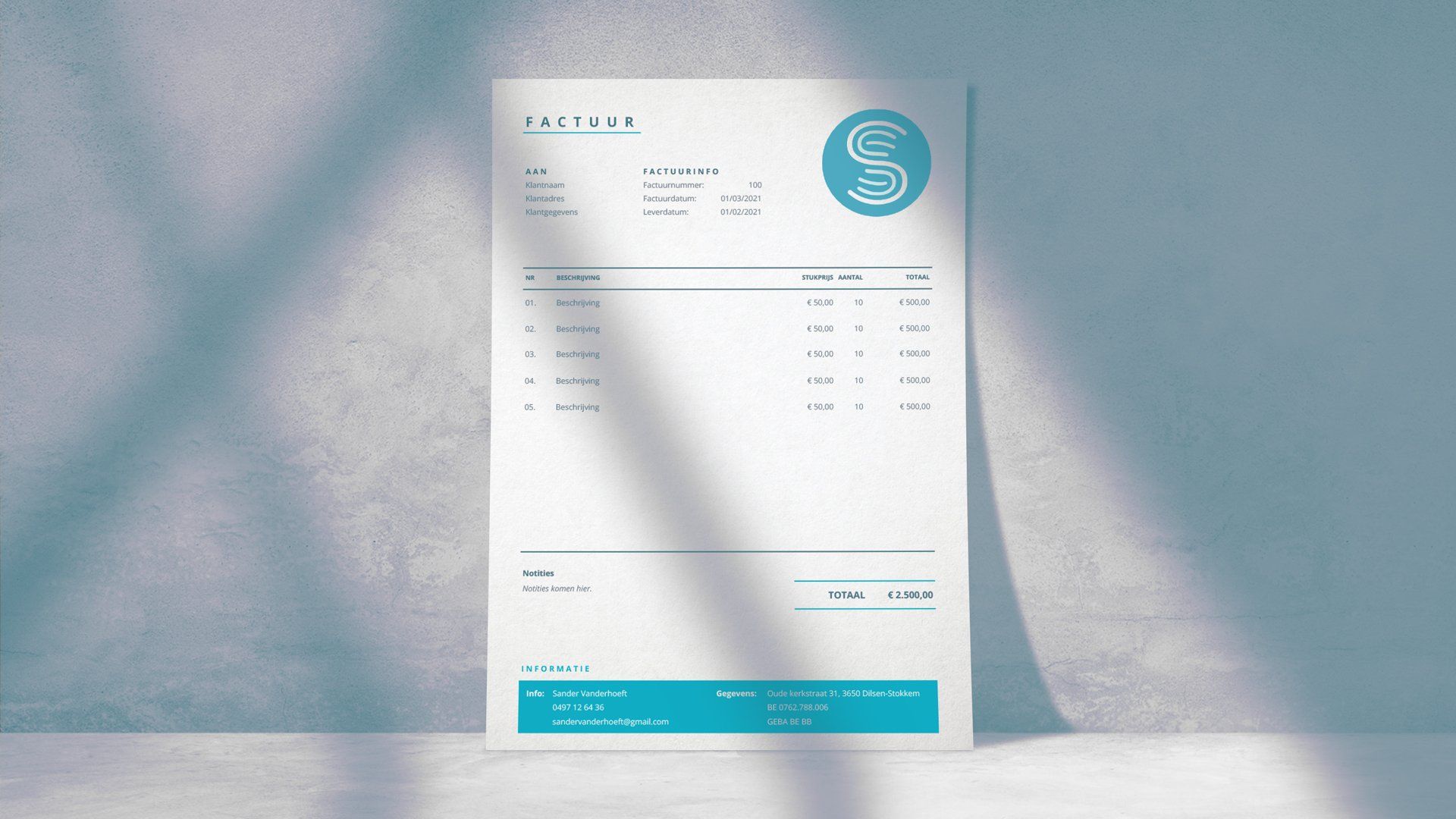
The overall brand identity centers around core values of rest, relaxation, and expert care. The visual language utilizes a soothing, serene color palette designed to immediately evoke a sense of calm and well-being.
This gentle aesthetic works in harmony with modern typography to establish an approachable yet deeply professional presence, giving client touchpoints a cohesive and inviting atmosphere.
(synopis)
SV Massages needed a gentle, professional brand identity to establish a welcoming presence. Adept Studio developed a cohesive brand that highlights the core values of personal attention, relaxation, and physical well-being.
(the logo)
The logo features an elegant, abstract icon depicting two hands engaged in a soothing massage movement, subtly integrated with a flowing S-shape detail as a personal touch for Sander, the owner.
Designed with clean, organic line work, the mark communicates hands-on expertise and personal attention while maintaining a refined, modern look that translates effortlessly across print and digital media.
(the brand)
The overall brand identity centers around core values of rest, relaxation, and expert care. The visual language utilizes a soothing, serene color palette designed to immediately evoke a sense of calm and well-being.
This gentle aesthetic works in harmony with modern typography to establish an approachable yet deeply professional presence, giving client touchpoints a cohesive and inviting atmosphere.
Are you ready to discuss your next project?
