
Project
A bold visual identity and website for a funky Italian takeaway concept
(client)
Crosta
(industry)
Street Food Concept
(services provided)
Strategy
Brand Identity
Web Design, Web Development
Print & Collateral Design
(project turnaround
time)
2 months
Project
A bold visual identity and website for a funky Italian takeaway concept
(client)
Crosta
(industry)
Street Food Concept
(services provided)
Strategy
Brand Identity
Web Design, Web Development
Print & Collateral Design
(project turnaround
time)
2 months
(synopis)
Crosta is a unique, funky, and authentic Italian takeaway and food store concept located in the heart of Maastricht. In close collaboration with the founders of this vibrant new establishment, Adept Studio set out to build a striking visual identity that truly commands attention.
Beyond defining the core visual branding and print materials, we created a powerful digital platform tailored to elevate the entire brand experience and establish a memorable local presence.
(the logo)
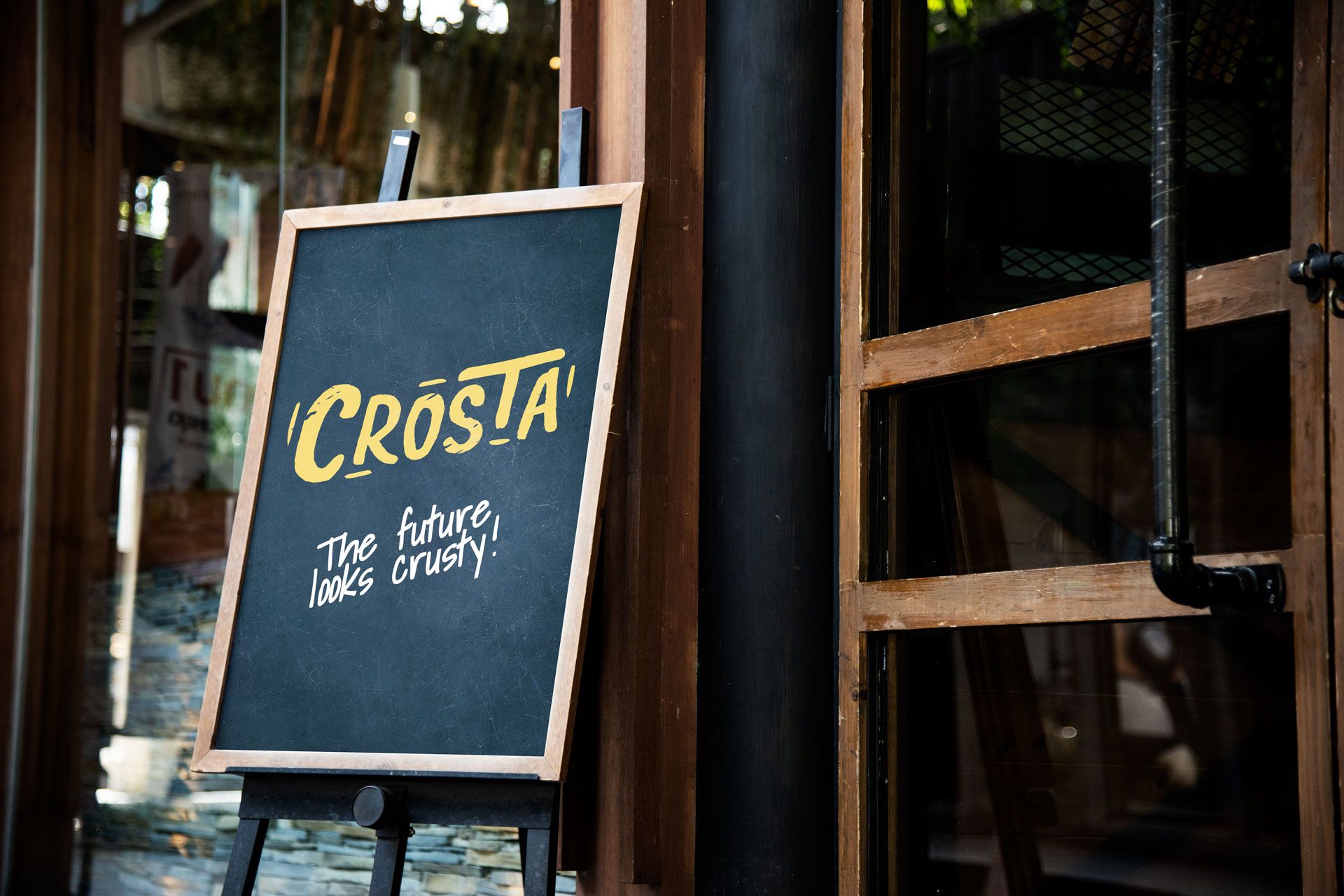
The brand identity centers around a playful and distinctive logo featuring a raw, grungy aesthetic that captures the concept's bold personality. Designed against a dark chalkboard backdrop with subtle texture and cracks, it makes a statement through a vibrant yellow accent.
This deliberate color choice breaks away from the traditional green, white, and red schemes commonly found in standard Italian takeaway joints, offering a fresh visual identity that feels both contemporary and unmistakably custom.
(the brand)
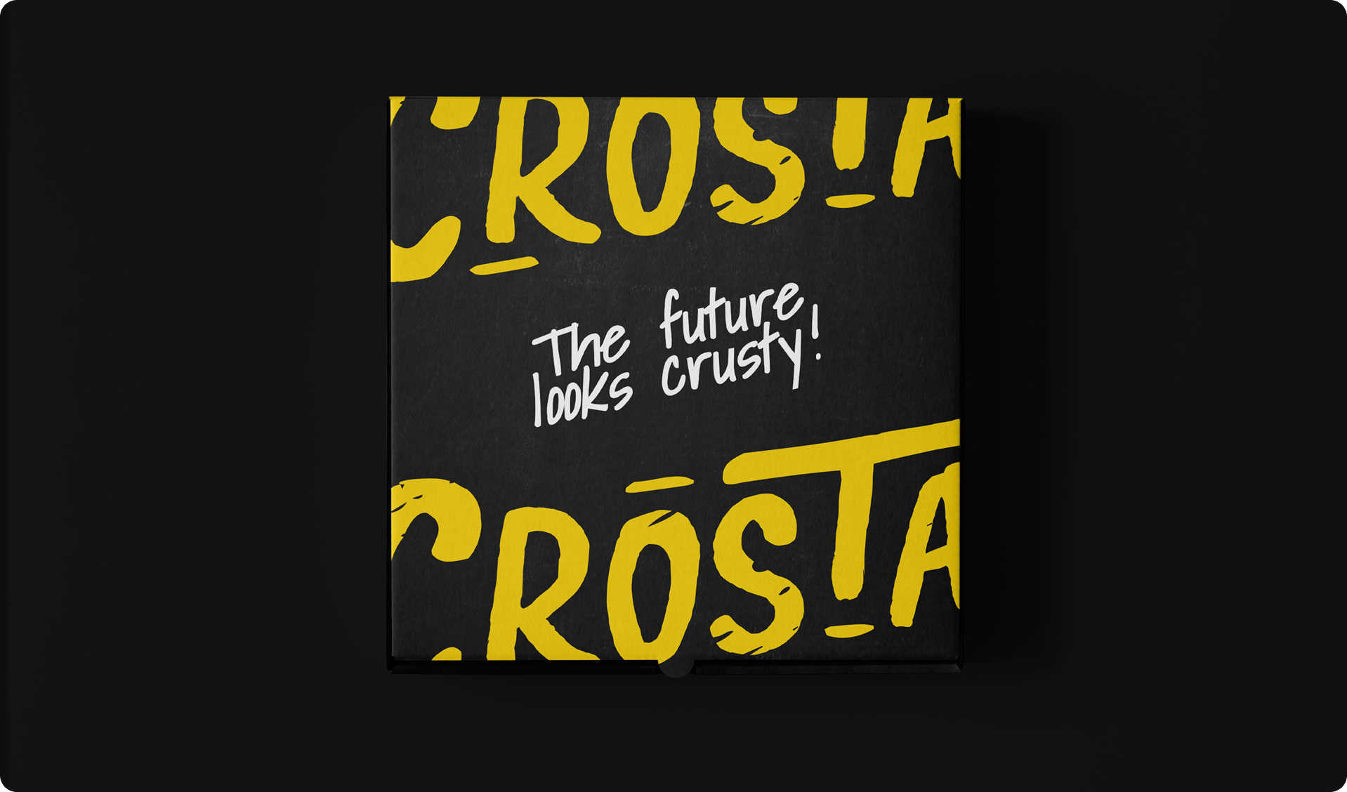
Crosta’s complete visual identity was crafted to surprise and engage customers at every touchpoint, mirroring the creative and unexpected flavors featured in their menu and product range.
The overall identity harmonizes authentic Italian tradition with a modern, rebellious edge. This energetic visual voice is applied consistently across all digital channels, custom print collateral, and physical packaging to deliver a cohesive experience from screen to store.
(the website)
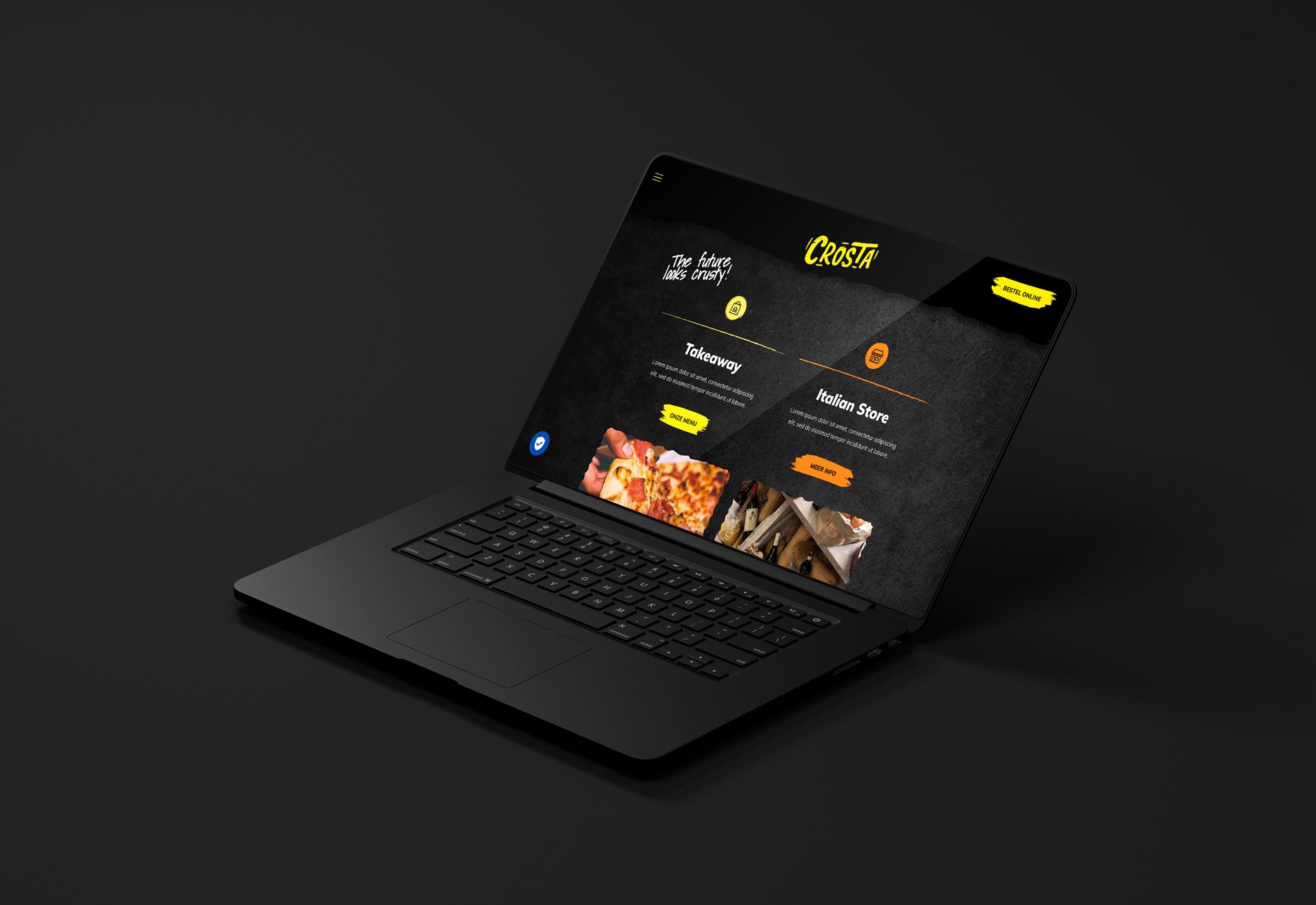
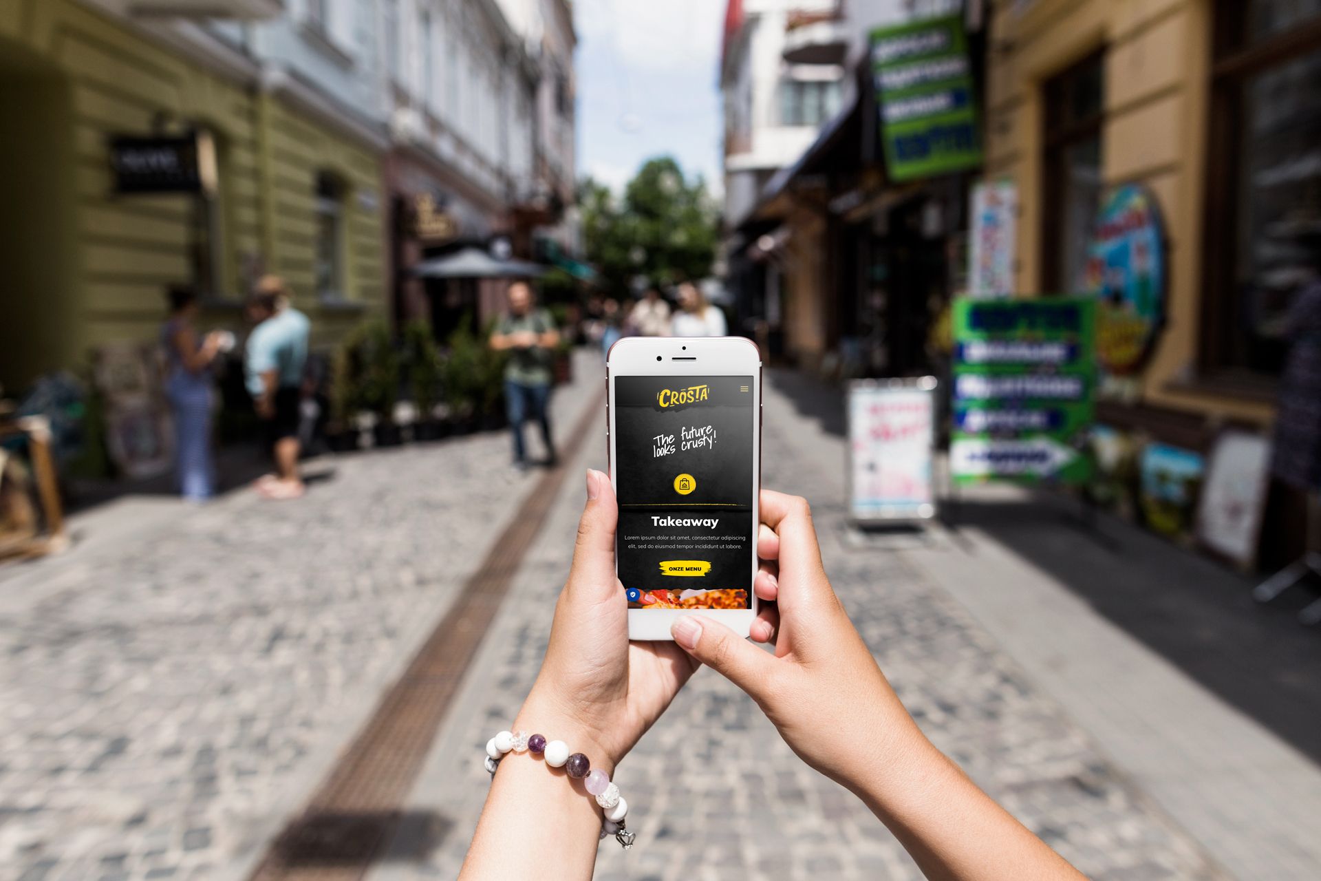
Adept Studio built a custom, fully responsive website that brings Crosta’s distinct energy to the digital space while maintaining seamless performance across all devices. To enhance navigation and clarify the brand's dual offerings, we introduced a deep dark orange as a secondary brand color.
This design choice creates a clear visual distinction between the fast-paced takeaway service and the curated authentic Italian food store, allowing visitors to easily explore and order.
(synopis)
Crosta is a unique, funky, and authentic Italian takeaway and food store concept located in the heart of Maastricht. In close collaboration with the founders of this vibrant new establishment, Adept Studio set out to build a striking visual identity that truly commands attention.
Beyond defining the core visual branding and print materials, we created a powerful digital platform tailored to elevate the entire brand experience and establish a memorable local presence.
(the logo)
The brand identity centers around a playful and distinctive logo featuring a raw, grungy aesthetic that captures the concept's bold personality. Designed against a dark chalkboard backdrop with subtle texture and cracks, it makes a statement through a vibrant yellow accent.
This deliberate color choice breaks away from the traditional green, white, and red schemes commonly found in standard Italian takeaway joints, offering a fresh visual identity that feels both contemporary and unmistakably custom.
(the brand)
Crosta’s complete visual identity was crafted to surprise and engage customers at every touchpoint, mirroring the creative and unexpected flavors featured in their menu and product range.
The overall identity harmonizes authentic Italian tradition with a modern, rebellious edge. This energetic visual voice is applied consistently across all digital channels, custom print collateral, and physical packaging to deliver a cohesive experience from screen to store.
(the website)
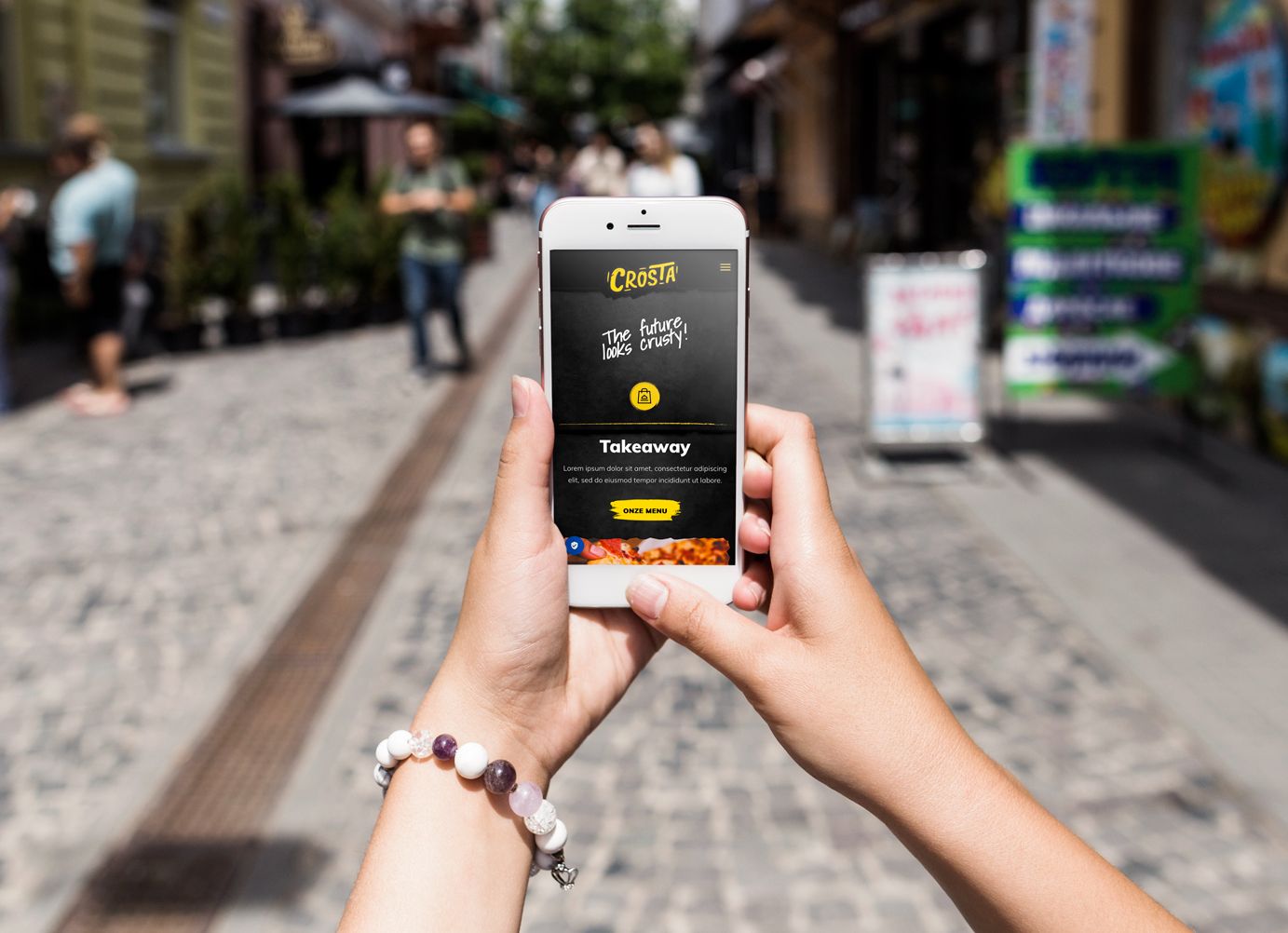
Adept Studio built a custom, fully responsive website that brings Crosta’s distinct energy to the digital space while maintaining seamless performance across all devices. To enhance navigation and clarify the brand's dual offerings, we introduced a deep dark orange as a secondary brand color.
This design choice creates a clear visual distinction between the fast-paced takeaway service and the curated authentic Italian food store, allowing visitors to easily explore and order.
Are you ready to discuss your next project?
